Women's Express
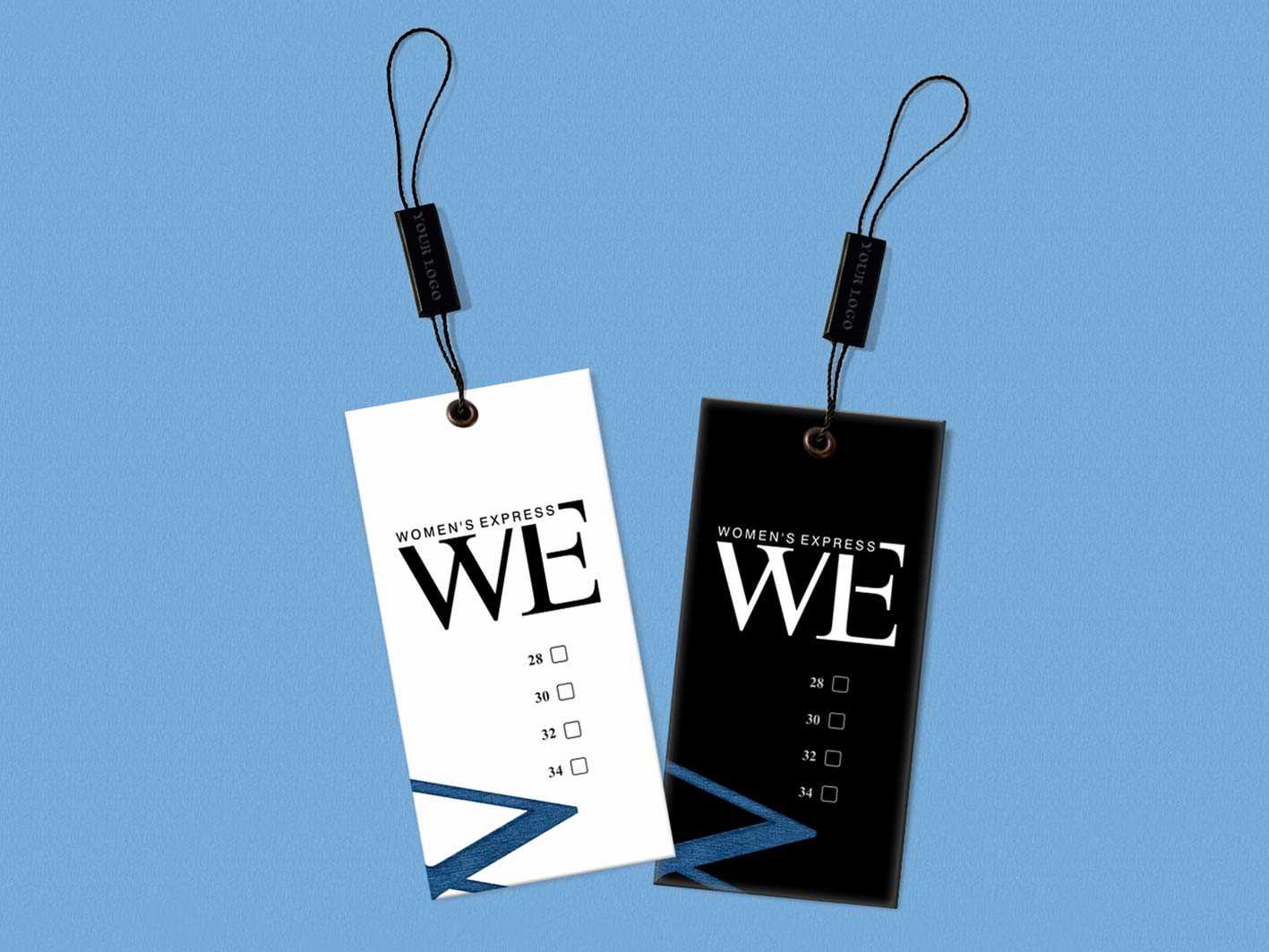
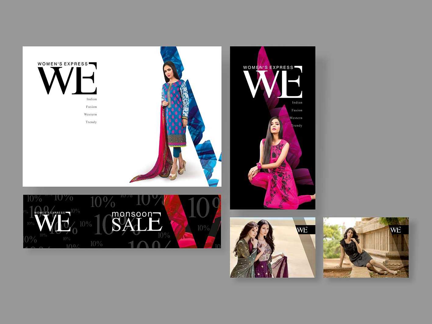
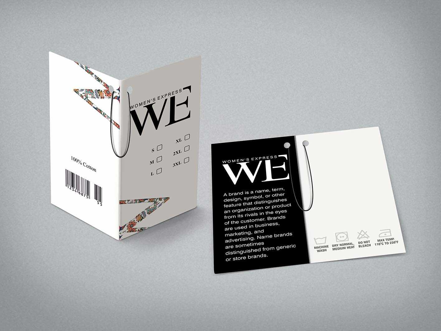
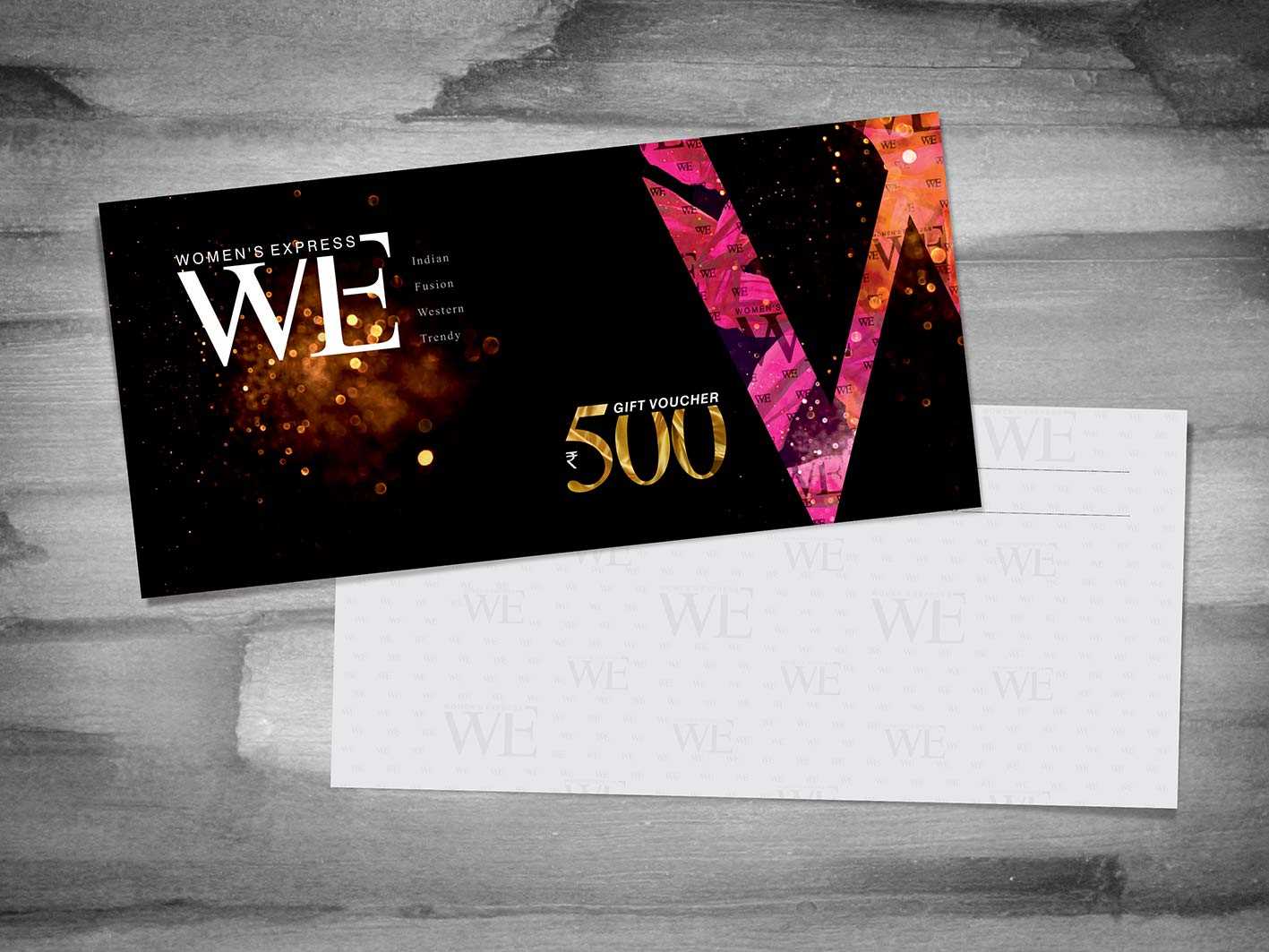
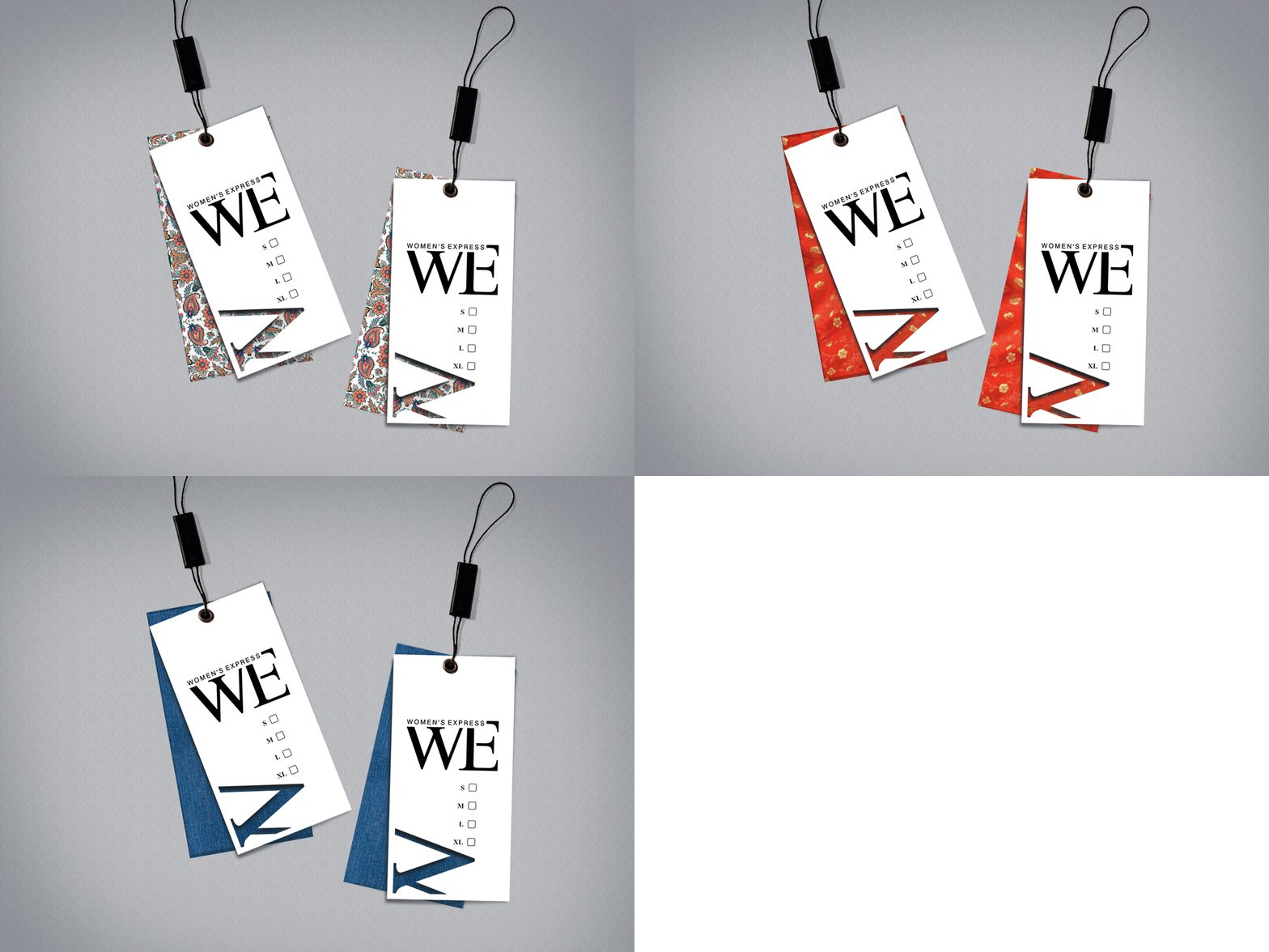
An apparel brand for women needed a global persona, right from the name to the packaging. The name had to sound smart, short and easy to recall yet quite stylish. So, there we were with the short and sweet ‘WE’, as we borrowed the first two letters from ‘Women’ (according to the pronunciation).
- Corporate Branding
- Environmental branding
Branding the attire for ‘her’
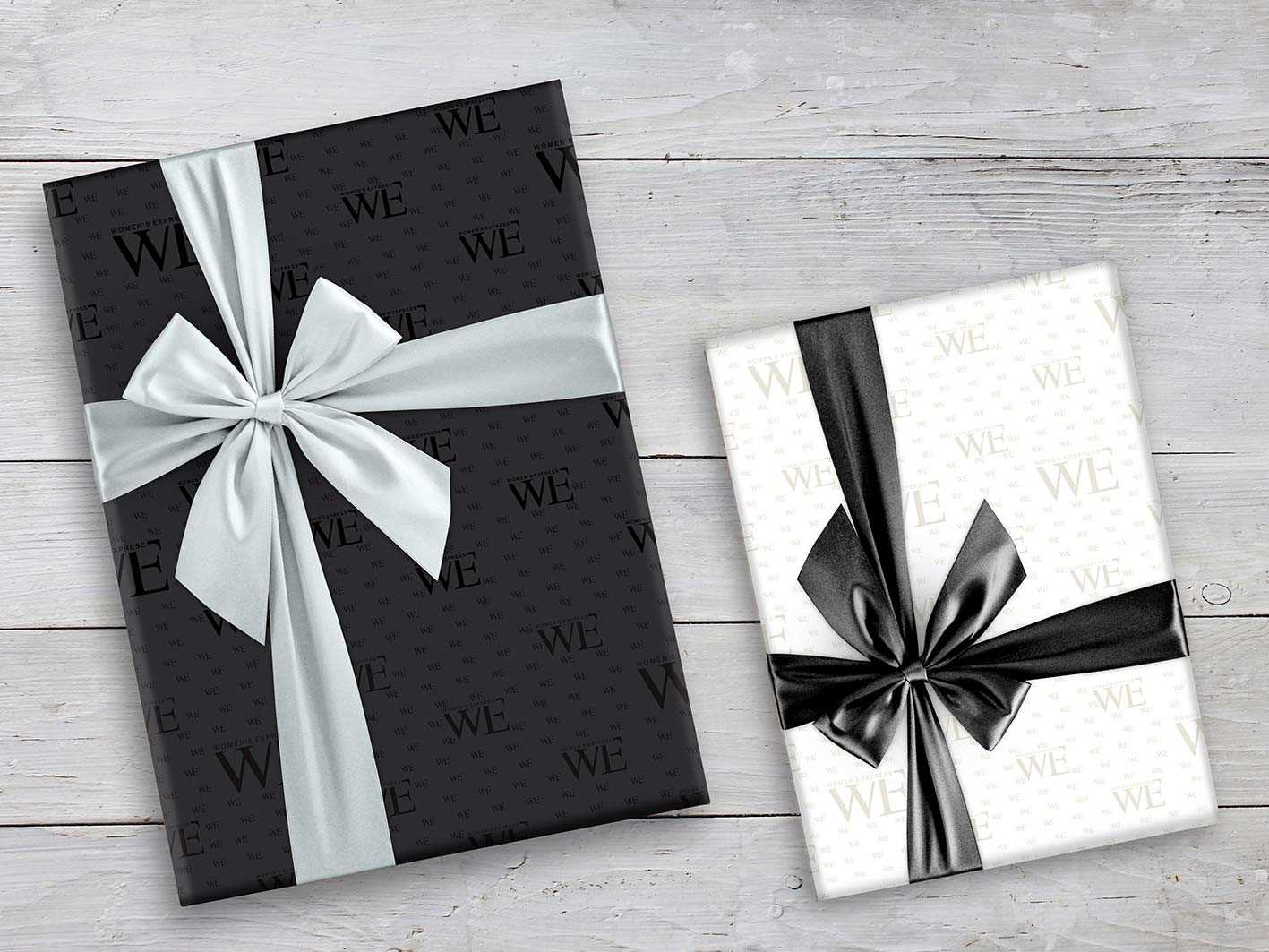
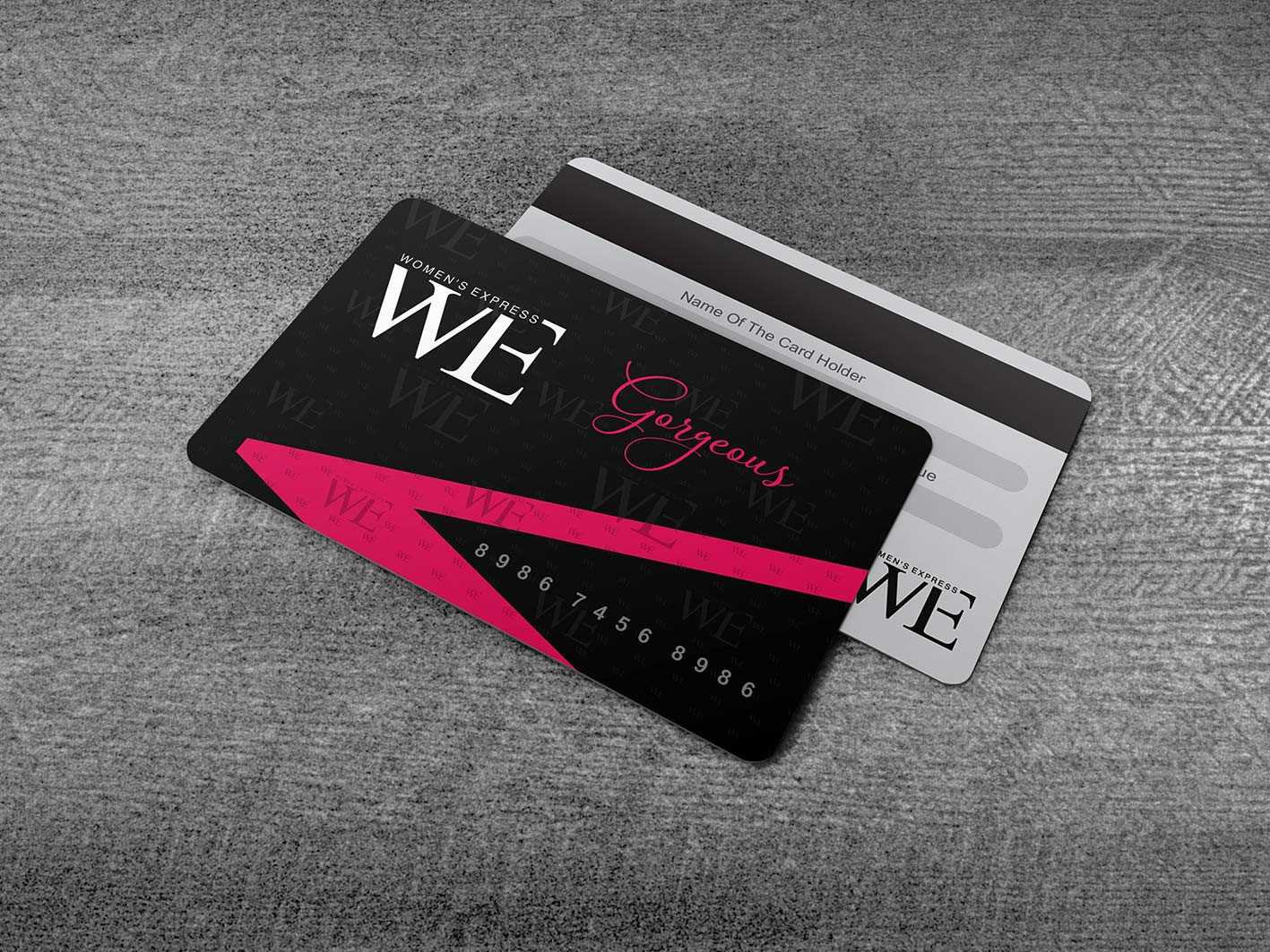
The colour scheme used the eternally classy combination of black & white. The neutral yet powerful black was used to define the savvy woman of today who is well aware of her strength. The white highlighted her pursuit of truth, her clarity of thought and her boundless intellect and reasoning. A tinge of wine red was introduced through the façade along with this colour scheme to indicate her passion and oomph.
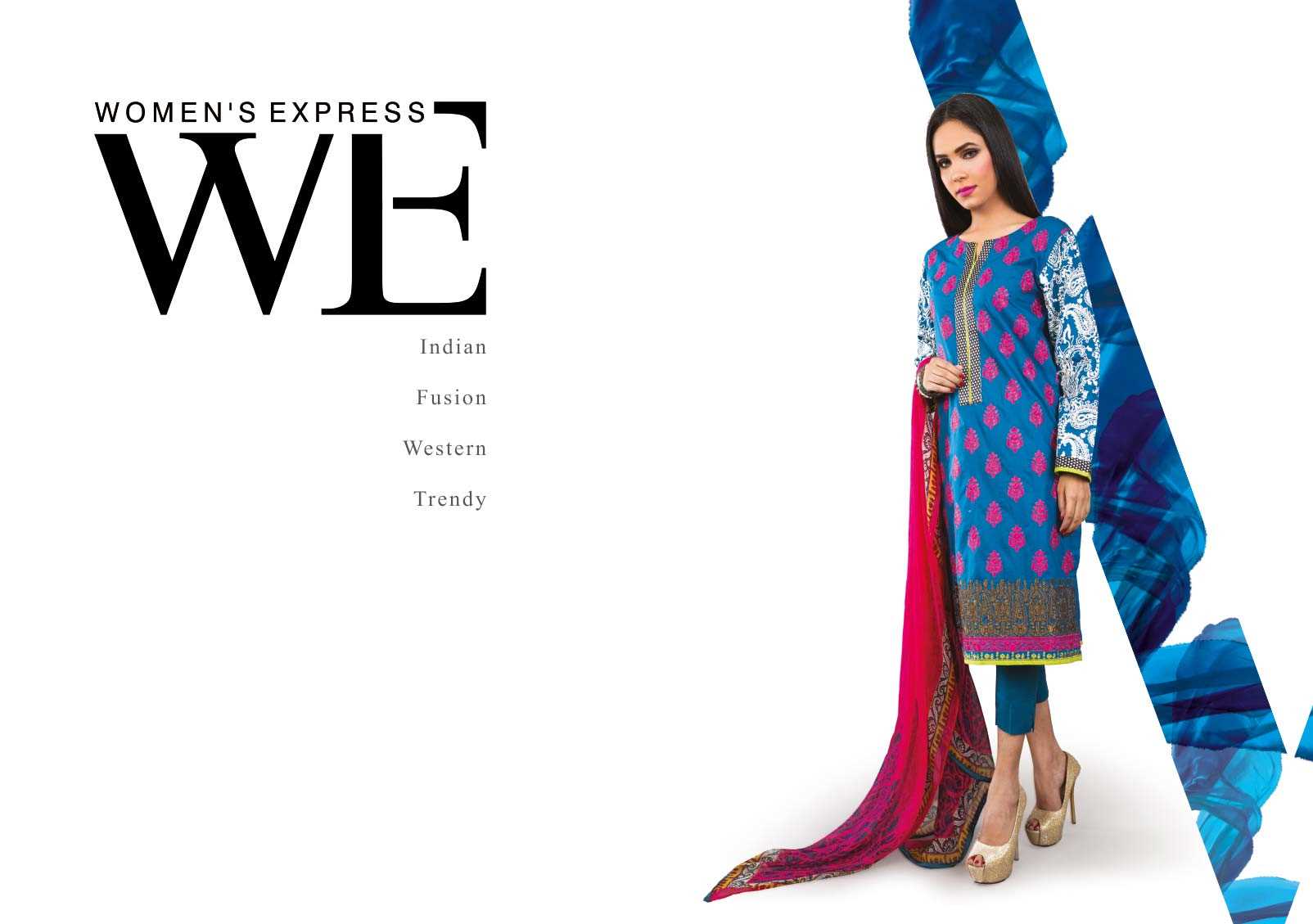
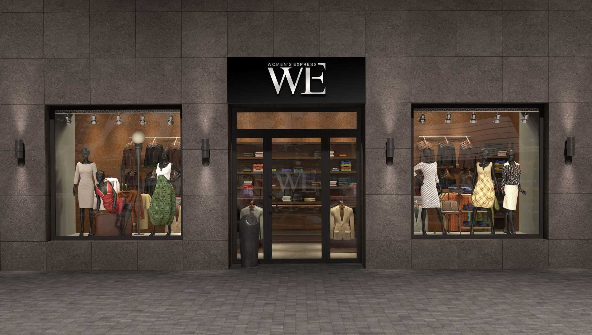
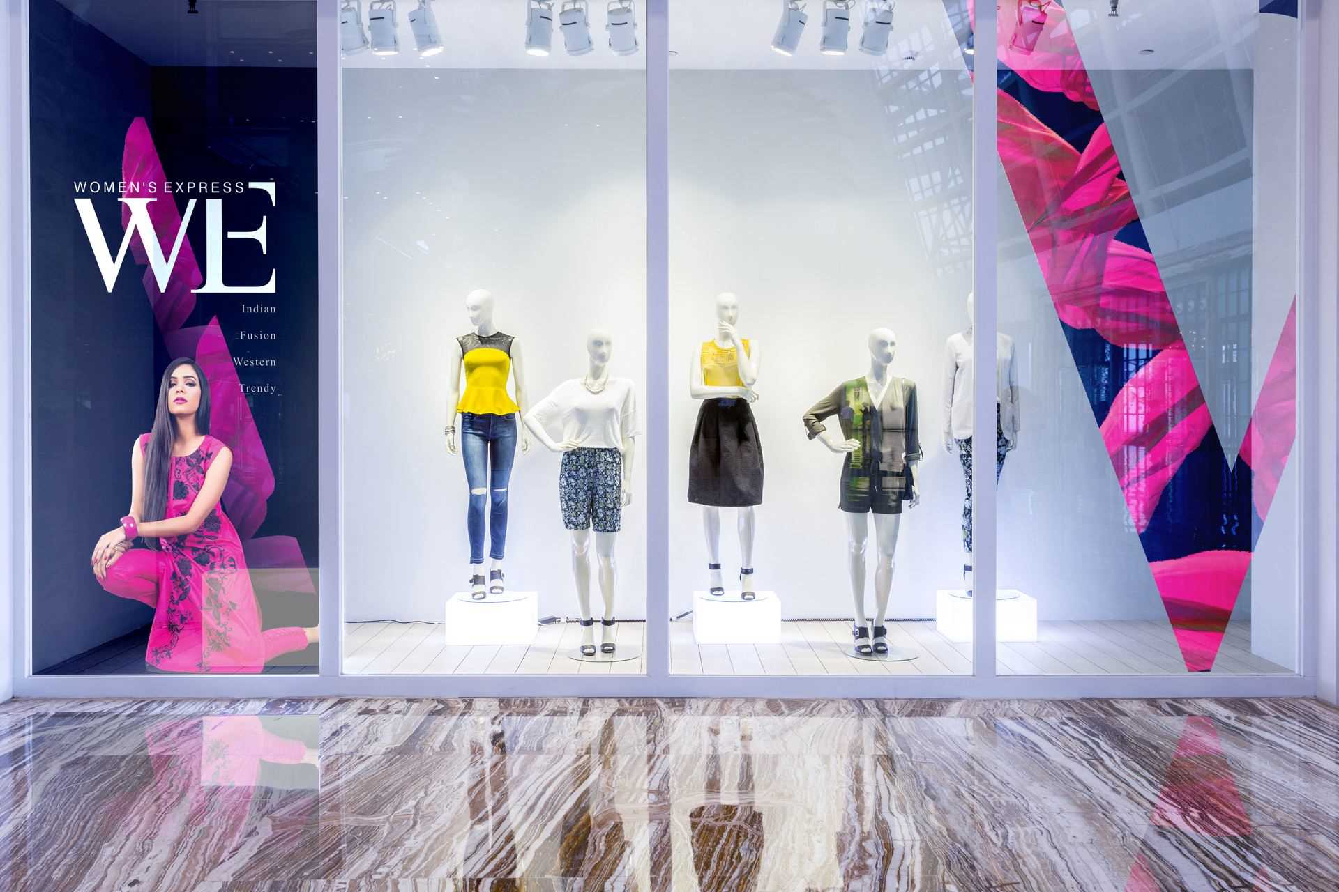
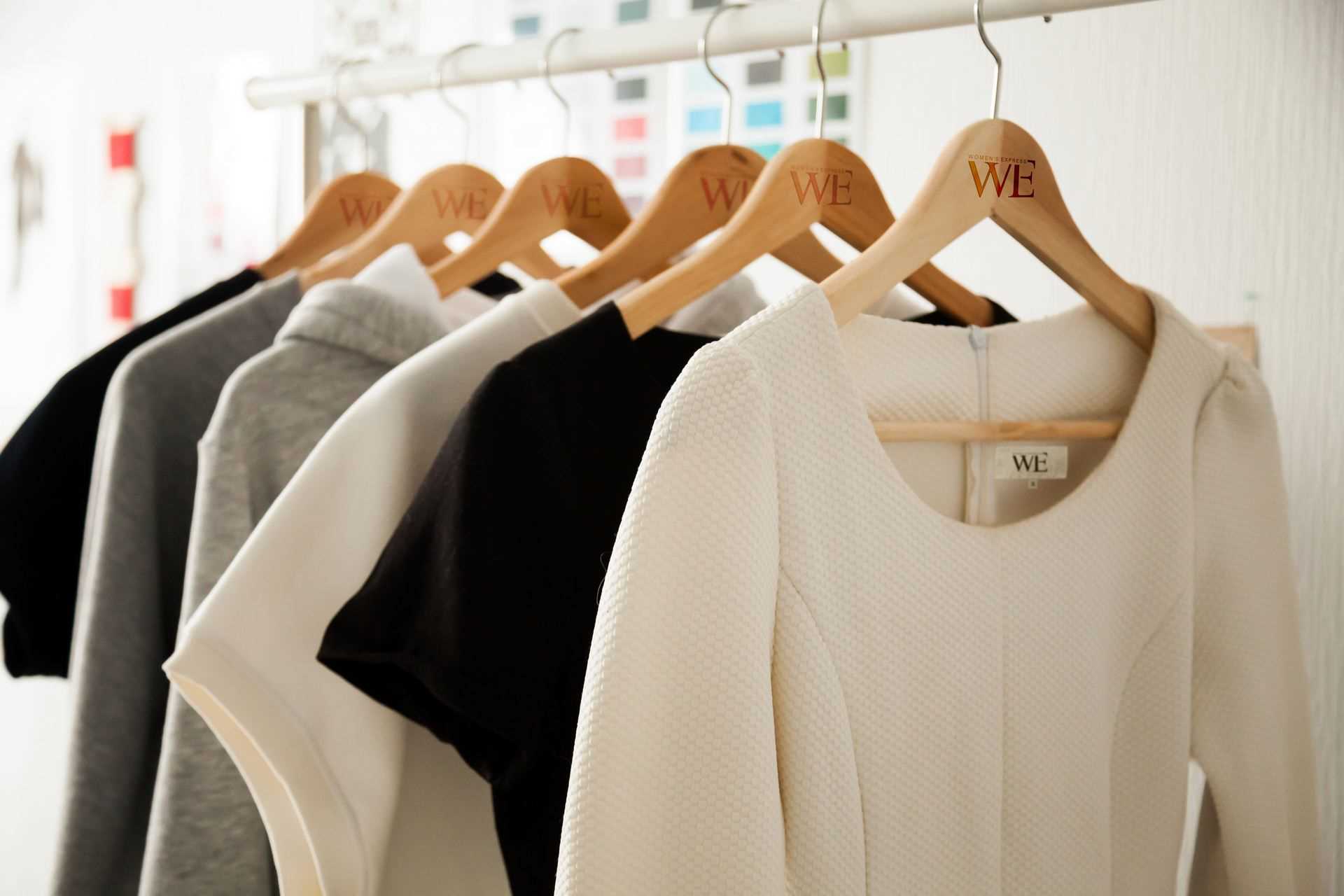
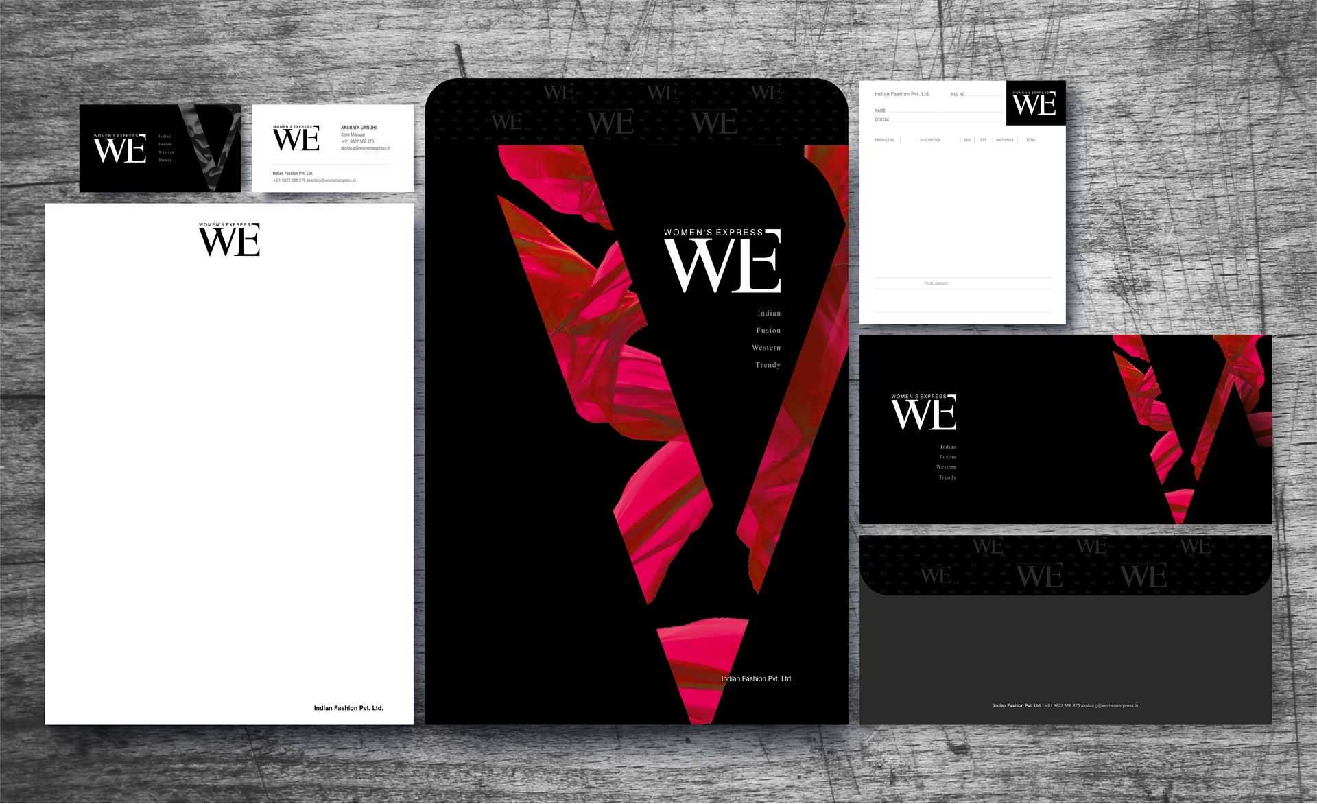

Their perception of a modern woman perfectly jelled with ours!
‘WE’- the women attire brand offers some out of the box creations appealing to the women’s psyche. 3 Dots Design Pvt. Ltd. was thoroughly in sync with our point of view. They added their creative dimension and made it really stand out! I am glad that my brand is in safe hands!
Mrs. Neha Kabra Director, WE